The central limit theorem is one of most important concepts in all of statistics. If you are not at all familiar with it, consult any introductory statistics book or watch this great introduction at Khan Academy. Shortly put, the central limit theorem says that if we draw random samples from some distribution, the sampling distribution of the mean will approach a Normal Distribution as the sample size increases. Regardless of whether the original data is Normal or not. In this post, I use SAS code to visualize an example of the central limit theorem.
Unfair Die Rolls Example in SAS
Lets us look at an example of drawing independent random samples from some non normal distribution. In this example we look at throwing an unfair die again and again. Suppose that the probability of throwing a 1 is 20%, 2 is 10%, 3 is 10%, 4 is 30%, 5 is 20% and 6 is 10%. This is a classical example of drawing samples from a Tabulated Distribution with uneven probabilities. Below is the SAS code that draws 100 independent samples each of size 10000 from the Tables Distribution using the RAND Function.
/* Draw samples from unfair die rolls */ %let NumSample=100; %let SampleSize=10000; data DieRolls; call streaminit(321); do sample=1 to &NumSample; do n=1 to &SampleSize; x=rand("Table", 0.2, 0.1, 0.1, 0.3, 0.2, 0.1); output; end; end; run; /* Visualize distribution of die rolls */ title 'Die Roll Frequency Distribution'; proc sgplot data=DieRolls; vbar x; xaxis values=(1 to 6); run; title; /* Calculate sample means */ proc means data=DieRolls noprint; class sample; output out=DieRollMeans(where=(_STAT_='MEAN' and _TYPE_=1)); run; /* Visualize samlping distribution of the mean */ title 'Sampling Distribution of the Mean'; proc sgplot data=DieRollMeans noautolegend; histogram x / scale=count; density x / type=normal; run; title; |
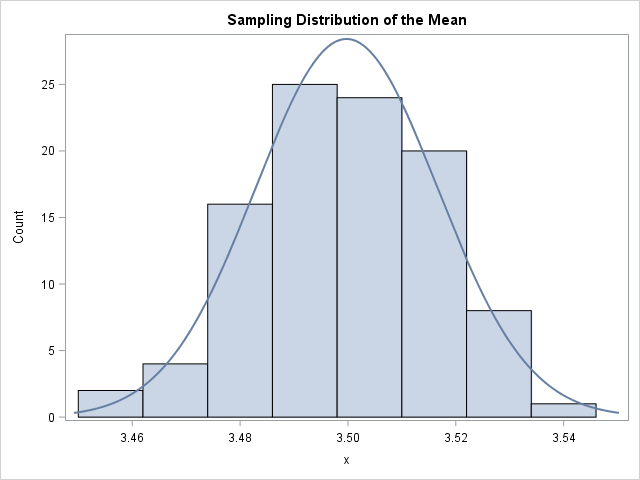
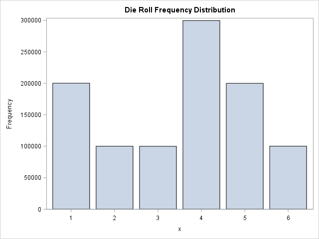 The first graph on the right is the distribution of the die rolls on the example. We see that the simulated values resemble the theoretical probabilities quite well. This distribution looks very non-normal. Now, I use PROC MEANS to calculate the sample means, write them to a dataset and plot the sampling distribution of the mean in the second plot to the right. This, on the other hand, looks quite normal. This is the magic of the Central Limit Theorem. You can take any distribution from the Probability Distribution Examples page, draw independent random samples and calculate the sample means and plot them, and it will approach a Normal Distribution as the sample size increases.
Poisson Example
To prove that this is not just the case with the tabulated distribution, let us look at another example. Next, we draw samples from a simple Poisson Distribution with the following code.
%let NumSample=100; %let SampleSize=10000; %let lambda=3; data PoissonSamples; call streaminit(321); do sample=1 to &NumSample; do n=1 to &SampleSize; po=rand("Poisson", &lambda); output; end; end; run; |
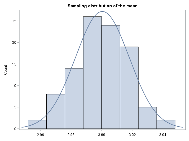
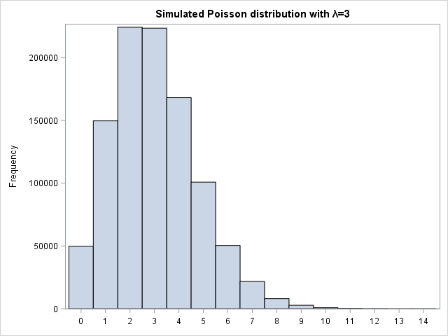 Again, we see that the simulated Poisson distribution resembles a theoretical Poisson density well. It definitely does not look normal. We then calculate the sample means and plot them on the right-side graph. Again, the sampling distribution of the means looks Normal with a large sample size. I encourage you to play around with the sample sizes in the two statistics examples above. How does the distribution of the sample means change? Also, you can asses normality of the sampling distribution of the mean in a more strict, theoretical manner using PROC UNIVARIATE as described in the blog post Fit Distribution to Continuous Data in SAS.
You can download the entire code including the whole Poisson example here.