A scatter plot is a great way to visualize how your data is distributed. You can quickly get a visual impression of the distribution and the dispersion of your data. Furthermore, the scatter plot is often overlayed with other visual attributes such as regression lines and ellipses to highlight trends or differences between groups in the data. However, in these examples, I will focus solely on the scatter plot in itself in SAS.
A Simple SAS Scatter Plot with PROC SGPLOT
/* Draw Simple Scatter Plot with PROC SGPLOT */ title "Simple Scatter Plot With PROC SGPLOT"; proc sgplot data=sashelp.iris; scatter x=sepallength y=sepalwidth / group=species; run; title; |
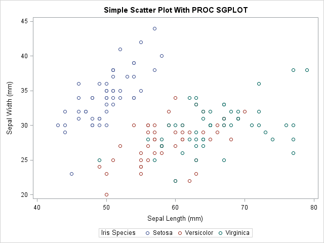
You can see the resulting plot to the right. The plot visualizes the distribution of sepal lengths against sepal widths and separates flower species with different colors in the plot. Though, it can be a bit hard to difference one species from another due to the shape of the scatters. Consequently, in the next section we make alterations to resolve this.
A Few modifications added
As you can see, the plot above is very simple. With few modifications, you can make this even more presentable and easier to interpret.
ods graphics on / attrpriority=none; title "Scatter Plot With Modifications With PROC SGPLOT"; proc sgplot data=sashelp.iris noautolegend; styleattrs datasymbols=(circlefilled squarefilled starfilled); scatter x=sepallength y=sepalwidth / group=species; keylegend / location=inside position=NE across=1; run; title; |
In the code above, I have made two changes to the plot. First off, I set the attrpriority option equal to NONE before the SGPLOT Procedure. Then I use the styleattrs statement in PROC SGPLOT to overwrite how the groups are distinguished in the plot. See the article Overriding How Groups Are Distinguished to learn more about this technique.
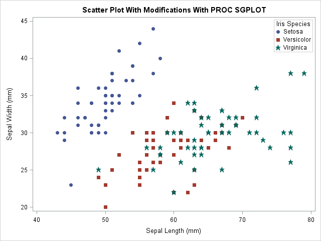
Next, I use the NOAUTOLEGEND option in the PROC SGPLOT statement to suppress the default legend under the plot in the chart above. Then I use the keylegend statement and specify location=inside, position=NE and across=1 to control that I want the legend placed in the upper right corner, inside the plot are and I want them stacked, not side by side. In my experience, it is very rare that you want the default legend present in the plot. If you want a legend in your plot, control it yourself.
Summary
The scatter plot is a powerful tool to visually assess the distribution and dispersion of your data. This article demonstrated how easy it is to create a scatter plot in SAS. Due to the simplicity of the introduction, the examples presented are very simple. Naturally, there are thousands of ways for you to modify the plot to highlight the points you want to present. I encourage you to consult the SAS documentation on the Scatter Statement in PROC SGPLOT to see what options are available. Also, check out the examples on the same page.
Finally, I encourage you to check ot the ODS Category and the Graph Category of my blog to see other examples of how to use ODS and Graphing in SAS.
You can download the entire code from this example here.