 The bar chart is probably the most used chart of all. It is easy to create a simple bar chart in SAS with PROC SGPLOT. Furthermore, it is easy to alter the chart to your liking and add graphical features and relevant statistics. This example page shows you the very basics and some more of how to create a bar chart in SAS.
Simple Bar Charts In SAS
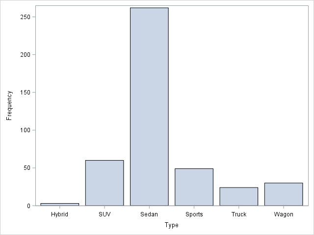
First, let us create a very simple bar chart in SAS. The simplest way to do so, is to specify the VBAR Statement followed by the variable you want to plot. This creates a vertical bar chart with the unique categories on the horizontal axis and frequency counts on the vertical axis.
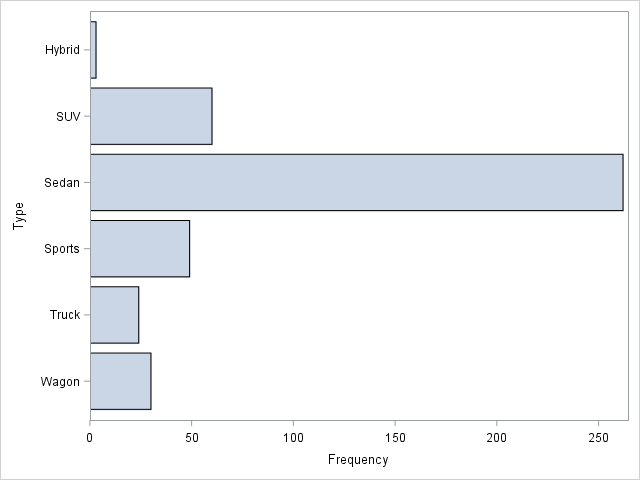
Naturally, we can also use the HBAR Statement to create a corresponding horizontal bar chart. You can see the results of the two bar charts to the right.
proc sgplot data=sashelp.cars; vbar type; run; proc sgplot data=sashelp.cars; hbar type / colormodel=twocolorramp; run; |
These graphs are simple and they get the job done. However, they are not very exiting to look at. A graph should be intriguing at first sight. Also, there is quite a lot of unnecessary chart junk. Always keep your graphs as clean as possible. Never leave fancy stuff in there, that does not contribute to the point you want to address. This is easy to accomplish with PROC SGPLOT, so use it to your advantage.
PROC SGPLOT Bar Chart With Extra Features
Now, let us use some of the many statements and options to enhance the graph. First of all, I use the resonse= option in the vbar statement to explicitly specify the response variable of interest. I use the datalabel option to request mpg_city values at each bar. Lastly, I use the colorresponse= option to specify that I want the color of the bars to reflect the value of the response variable. The warmer the color, the higher the value.
title "Vertical Bar Chart"; title2 "Mileage By Type"; proc sgplot data=sashelp.cars noborder; vbar type / response=mpg_city stat=freq barwidth=0.8 datalabel group=type colorresponse=mpg_city; xaxis display=(nolabel noline noticks); yaxis display=(noline) grid; keylegend / noborder; format mpg_city 8.0; run; title; |
This looks more interesting. Furthermore, I have added descriptive titles to my graph. Also, I have added a horisontal grid only. This is usually a good idea when you have a vertically oriented graph.
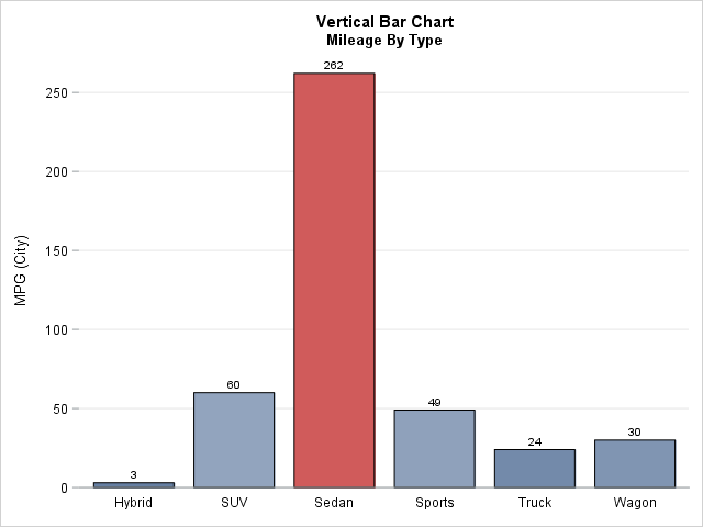
Lastly, I get rid of as much as the chart junk as I can with the nolabel, noline and noticks arguments in the display= option.
Summary
PROC SGPLOT lets you draw bar charts with ease in SAS. Also, the many options and statement lets you control the visual attributes of the graph. This makes it easy to control every part of the graph. And you should do just that. Do not please yourself with the simplest possible version. Spend the extra minutes and make your graph look good. It is worth it.
For a more thorough introduction to the VBAR Statement, see the Getting started with SGPLOT – Part 2 – VBAR at the Graphically Speaking Blog.
For more SAS graph examples see the example page Statistical Graph Code Examples. Also, see A Line Plot in SAS and A Scatter Plot in SAS.
You can download the entire code from this example here.