The box plot is a nice way of visualizing differences between groups in your data. It lets you identify outliers, common descriptive statistics, inter quaratile ranges, confidence interval and more. This example page shows you how to draw a simple box plot and how to modify the many visual attributes in SAS with PROC SGPLOT.
A Simple SAS Boxplot with PROC SGPLOT
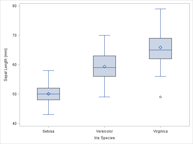
First, let us look at a very simple example. I use the sashelp.iris data set in this example. We use the VBOX Statement in PROC SGPLOT and specify SepalLength as the analysis variable. Furthermore, I specify Species as the categorical variable in the category= option.
proc sgplot data=sashelp.iris; vbox SepalLength / category=Species; run; |
You can see the result from PROC SGPLOT to the right. This is a simple vertical box plot. The square in the box indicates the group mean. The vertical line inside the box is the median (50’th percentile). The two vertical lines that constitute the top and bottom of the box are the 25’th and 75’th percentiles respectively. Consequently, the distance between them is the Inter Quartile Range (IQR). The whiskers are calculated as  1.5 IQR. Finally, the SAS procedure draws the outliers as a small dot.
A Few modifications added
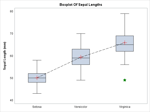
As you can see, the plot above is very simple. With few modifications, you can make this even more presentable and easier to interpret.
title "Boxplot Of Sepal Lengths"; proc sgplot data=sashelp.iris noautolegend; vbox SepalLength / category=Species connect=mean connectattrs=(color=black pattern=mediumdash thickness=1) meanattrs=(symbol=plus color=red size=20) lineattrs=(color=black) medianattrs=(color=black) whiskerattrs=(color=black) outlierattrs=(color=green symbol=starfilled size=12); xaxis display=(noline noticks nolabel); yaxis display=(noline noticks) labelattrs=(weight=bold); run; title; |
You can see the modified plot to the right. Obviously, you can modify a lot more than this, but the above code serves as a nice template for a box plot in SAS.
Needless to say, you can also use the HBOX Statement to draw a horizontal box plot in SAS. Most of the options are similar between the two statements.
Summary
In this example, I demonstrate how to use PROC SGPLOT to draw simple box plots in SAS. Furthermore, I show an example of how to modify the plot to your liking.
I encourage you to check ot the ODS Category and the Graph Category of my blog to see other examples of how to use ODS and Graphing in SAS.
You can download the entire code from this example here.