When create graphs in SAS with PROC SGPLOT, you should aim for control. You can control a lot of the features of the graph with the STYLEATTRS Statement. Also, you can control the visual features of specific parts of the plot directly in the plot statements after the forward slash. However, it does not give you full control. Whether you specify Datacolors or Linepatterns or something third, the visual features in your graph will depend on the order of your data. The value of the variable that the procedure reads first, will get the first feature that you specify in those options. However, there is a way to get full control. When you want to associate specific values with specific visual attributes, use a discrete attribute map. This post introduces the concept and shows a simple code example of how to use it.
SAS Code Example without attribute map
Let us look at the Sashelp.Class example data set. I want to create a simple Scatter Plot With PROC SGPLOT of the students’ height vs weight. To do so, I want to highlight the gender groups. To do so, I want different visual attributes to apply for males and females. Usually, we would draw the male values blue and the female values red. Therefore, I naively draw the scatter plot like this and specify red and blue in the styleattrs datacontrastcolors like this
proc sgplot data=sashelp.class; styleattrs datacontrastcolors=(red blue); scatter x=height y=weight / group=sex; run; |
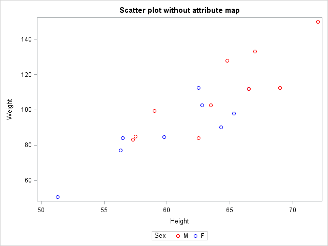 You can see the result to the right. Indeed, we did produce a scatter plot and we did separate the gender using the GROUP= Option in the Scatter Statement. However, male scatters are red and female scatters are blue. This happens because red is listed first in the Datacontrastcolors Option and the first observation in the data set is male.
SAS Code Example with attribute map
It seems like the above approach does not give me the desired control. I do not want to check what value is listed first in the data every time I create the plot. Instead, I create a discrete attribute map data set. A discrete attribute map is a data set, that relates particular variable values to specific visual attributes in the graphing procedure in which you use it.
There are two required variables in an attribute map data set. ID and Value. The ID variable represent the map name to be specified in the plot statement. You can have Multiple Attribute Maps in a single data set. The value variable represent the variable value for which you want to apply the following visual features. Last comes variables that represent the specific visual features you want to apply to the relevant variables. You can see the different variable names accepted at the SAS Documentation Page.
data MyAttrMap; length id $4 value $1 markercolor $10 markersymbol $12; input id value markercolor markersymbol markersize; datalines; MyID M lightblue starfilled 10 MyID F lightred squarefilled 10 ; |
 In my attribute map, I have two observations. One for male and one for female. I have three variables controlling visual attributes: markercolor, markersymbol and markersize. You can see the values above.
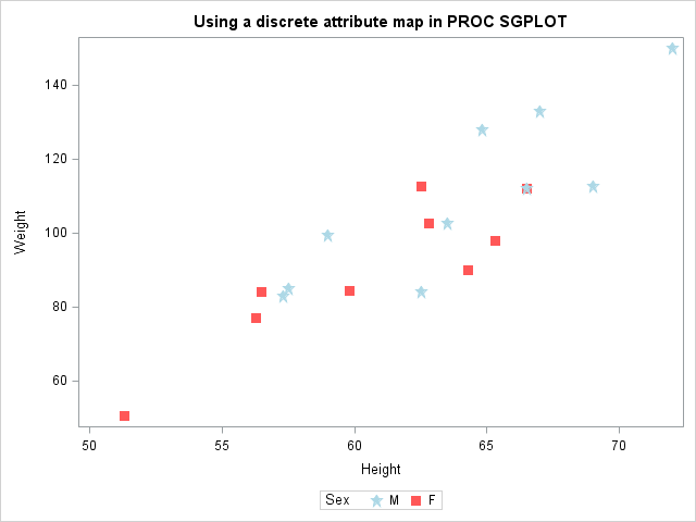
Next, we use the discrete attribute map in the PROC SGPLOT. We specify the data set name MyAttrMap DATTRMAP= Option in the procedure statement. Then, we draw a scatter plot and specify the ATTRID= option in which we point to the MyID attribute map.
You can see the result to the right. We correctly associate males with the blue color and females with red. Just like intended. Additionally, this code does not depend on the order in the data set, as was the case in the previous example. Furthermore, we take control over the size and shape of the markers, all within the data step. This makes the PROC SGPLOT code simpler.
title "Using a discrete attribute map in PROC SGPLOT"; proc sgplot data=sashelp.class dattrmap=MyAttrMap; scatter x=height y=weight / group=sex attrid=MyID; run; title; |
Summary
The discrete attribute map is an extremely powerful tool when you want to associate specific variable values with specific visual characteristics in a SAS graph. In this post we saw an example of how and when to use the discrete attribute map. In a future blog post, I will demonstrate how to use the corresponding Range Attribute Map In PROC SGPLOT.
The features of the discrete attribute maps are not limited to scatter plots. For more examples of using discrete attribute maps in statistical graph procedures see Attribute Maps – 1 and Attribute Maps – 2 at the Graphically Speaking Blog. Also, see the related post 5 Tips to Control the Legend in PROC SGPLOT.
You can download the entire code from this example here.