A histogram is a nice way to get a visual overview of the distribution of your data in SAS. In this example page, I will demonstrate how to create a histogram with SAS code. I will do so with PROC SGPLOT and PROC UNIVARIATE. First, I will create the simplest histogram possible with Proc Sgplot. Next, I will demonstrate how to alter the plot with the many options available. Finally, I will demonstrate how to draw a histogram with Proc Univariate.
Simple Histogram in SAS With PROC SGPLOT
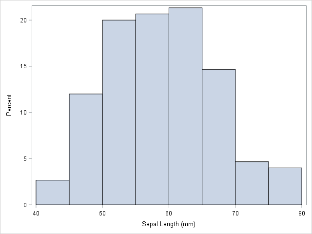
First, let us see how to draw a simple plot with Proc Sgplot. I simply specify the Histogram Statement followed by the variable I am interested in. You can see the result below.
proc sgplot data=sashelp.iris; histogram sepallength; run; |
Result:
Altering the Histogram in PROC SGPLOT
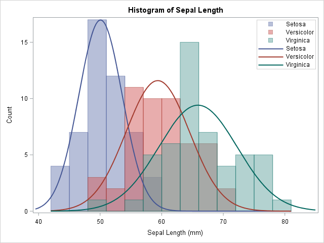
Next, let us make adjustments to the plot. First, I use the Group= Option and specify Species. This way, I draw three histograms in one plot. Since there are three instead of one, I use the transparency option to be able to compare them. Finally, I set the Scale=Count. By default, the scale is in percent. You can see this in the plot above.
Next, I use the Density Statement to overlay normal curves on each histogram. Again, I use the Group= Statement to draw a density curve for each species. Finally, I use the Keylegend Statement to control the appearance and position of the legend in the plot. You can see the result from this SAS code example below.
title "Histogram of Sepal Length"; proc sgplot data=sashelp.iris; histogram sepallength / group=species transparency=0.5 scale=count; density sepallength / type=normal group=species; keylegend / location=inside position=topright across=1; run; title; |
Result:
Histogram in SAS With PROC UNIVARIATE
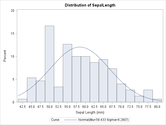
Proc Sgplot is not the only way to draw a histogram in SAS. Proc Univariate also supports a Histogram Statement. The syntax is a bit different from PROC SGPLOT though. Below, I create a simple plot with Proc Univariate with a few options. There are many more if you browse the documentation. You can see the result below.
ods select Histogram; proc univariate data=sashelp.iris; histogram sepallength / normal(color=blue) ctext = blue midpoints = 45 to 80 by 2.5; run; ods select all; |
Result:
Summary
In this example page, I demonstrate how to create histograms in SAS using Proc Sgplot and Proc Univariate. The syntax is quite different between the two. If your only goal is to draw the histogram, Proc Sgplot is the right tool. If you have to do other statistical analysis, you may consider Proc Univariate. I encourage you to browse the documentation of the SGPLOT Procedure to see the many options that help you create a nice histogram in SAS. For many more example, see Getting Started with SGPLOT – Part 5 – Histograms on the Graphically Speaking Blog.
For other graph code examples see A Bar Chart in SAS and a Line Plot in SAS.
You can download the entire code from this example here.